St Andrews HCI Research Group

News

SACHI @ IEEE VIS in Vancouver


Uta Hinrichs, Fearn Bishop and Xu Zhu are representing SACHI this year at the IEEE VIS’19 conference which is held in Vancouver, BC, Canada.

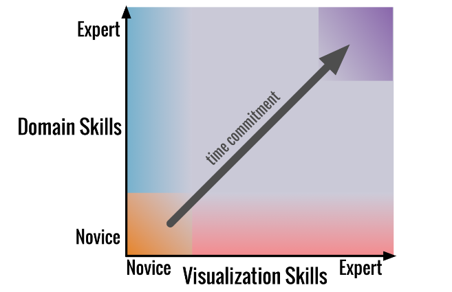
Fearn will present her research on exploring free-form visualization processes of children. Xu will present his work on how people visually represent discrete constraint problems. Uta has been involved on research that introduces design by immersion as a novel transdisciplinary approach to problem-driven visualization. She is also co-chairing the VIS Doctoral Colloquium this year, and is co-organizing the 4th workshop on Visualization for the Digital Humanities (VIS4DH’19).


Design by Immersion: A Transdisciplinary Approach to Problem-driven Visualizations [preprint]
Kyle Wm. Hall, Adam Bradley, Uta Hinrichs, Samuel Huron, Jo Wood, Christopher Collins and Sheelagh Carpendale.

Tuesday, Oct. 22 – 2:35-3:50 PM  [preview video]
Provocations; Ballroom A


Construct-A-Vis: Exploring the Free-form Visualization Processes of Children [preprint]
Fearn Bishop, Johannes Zagermann, Ulrike Pfeil, Gemma Sanderson, Harald Reiterer and Uta Hinrichs.

Wednesday, Oct. 23 – 2:20-3:50 PM
(De)Construction; Ballroom A


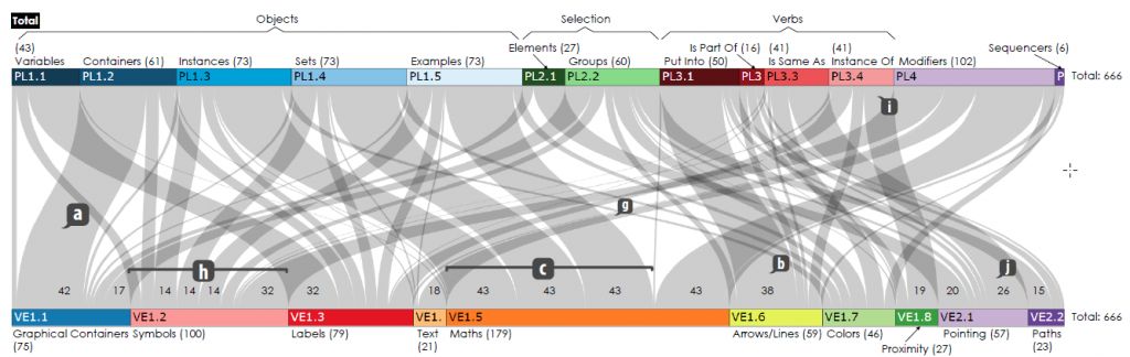
How People Visually Represent Discrete Constraint Problems [TVCG paper; PDF]
Xu Zhu, X, Miguel Nacenta, Özgür Akgün and Peter W. Nightingale

Thursday, Oct. 24 – 9:00-10:30 AM [preview video]
Vis for Software and Systems; Ballroom B


SACHI @ IEEE VIS in Phoenix


Uta Hinrichs is currently representing SACHI at the IEEE VIS conference in Phoenix, Arizona. If you are at IEEE VIS this week, too, come and say “hi” (look for the pink hair) and hear about the cool visualization work happening at SACHI. Find some of the activities Uta is involved in at the conference below, including the VIS4DH workshop, a tutorial on Analyzing Qualitative Data, and a Panel on Reflection on Reflection in Design Studies.
MORE

SACHI @ DIS 2017


The ACM SIGCHI conference on Designing Interactive Systems (DIS’17) is in full swing in Edinburgh, with a strong presence of SACHI research, especially in the area of Data Physicalization! Check out our related pictorial, full paper, workshop and workshop paper:
Trevor Hogan, Uta Hinrichs and Eva Hornecker. The Visual and Beyond: Characterizing Experiences with Auditory, Haptic and Visual Data Representations. In Proceedings of the 2017 Conference on Designing Interactive Systems (DIS’17), pp. 797-809, 2017.
Samuel Huron, Pauline Gourlet, Uta Hinrichs, Trevor Hogan and Yvonne Jansen. Let’s Get Physical: Promoting Data Physicalization in Workshop Formats. In Proceedings of the 2017 Conference on Designing Interactive Systems (DIS’17), pp. 1409-1422, 2017.
Fearn Bishop and Uta Hinrichs. Challenges of Running Constructive Visualization Studies with Children. In DIS’17 workshop on Pedagogy & Physicalization: Designing Learning Activities around Physical Data Representations.
Trevor Hogan, Uta Hinrichs, Yvonne Jansen, Samuel Huron, Pauline Gourlet, Eva Hornecker and Bettina Nissen. Pedagogy & Physicalization: Designing Learning Activities around Physical Data Representations. In Proceedings of the 2017 Conference on Designing Interactive Systems (DIS’17), 2017. http://dataphys.org/workshops/dis17/.

Workshop on Considering Technology through a Philosophical Lens


Thursday, May 18 from 10am – 1pm at the School of Computer Science

Technology fundamentally shapes our communication, relationships, and access to information. It also evolves through our interaction with it. Dialoguing across disciplines can facilitate an understanding of these complex and reciprocal relationships and fuel reflection and innovation.
This hands-on, participant-driven and experimental workshop will start a discussion of what can come from considering technology through a philosophical lens. MORE

Event details

  • When: 18th May 2017 10:00 - 13:00
  • Where: Cole 1.33a

Elicitation Interview Technique in InfoVis


Uta Hinrichs, Tevor Hogan, Eva Horneker

Overview

Information visualization has become a popular tool to facilitate sense-making, discovery and communication in a large range of professional and casual contexts. However, evaluating visualizations is still a challenge. In particular, we lack techniques to help understand how visualizations are experienced by people. In this paper we discuss the potential of the Elicitation Interview technique to be applied in the context of visualization. The Elicitation Interview is a method for gathering detailed and precise accounts of human experience. We argue that it can be applied to help understand how people experience and interpret visualizations as part of exploration and data analysis processes. We describe the key characteristics of this interview technique and present a study we conducted to exemplify how it can be applied to evaluate data representations. Our study illustrates the types of insights this technique can bring to the fore, for example, evidence for deep interpretation of visual representations and the formation of interpretations and stories beyond the represented data. We discuss general visualization evaluation scenarios where the Elicitation Interview technique may be beneficial and specify what needs to be considered when applying this technique in a visualization context specifically.

Publications

Trevor Hogan, Uta Hinrichs, Eva Hornecker. The Elicitation Interview Technique: CapturingPeople’s Experiences of Data Representations. IEEE Transactions on Visualization and Computer Graphics, 2016.

SACHI @ CHI 2016


CHI4GoodSACHI will have a great presence at the upcoming CHI’16 conference .
We welcome the opportunity to meet students interested in studying with us, colleagues interested in visiting or collaborating, or companies interested in our work. You can find us helping and involved throughout CHI 2016 with the presentation of 5 full papers, 1 note, 1 workshop, 1 workshop paper and other activities.
MORE

Now on Sale: FatFonts World Population Maps


fatFontPoster
Looking for a gift for a visualization aficionado? We are happy to announce that the first ever FatFonts World Population Map is now available in the Axis Maps store. All proceeds from the maps will be used to fund more FatFont-related research.
The map shows how the population of the world is distributed. It uses a typographic visualization technique–FatFonts–which allows you to read the exact number of people living in a particular area with a precision within 100,000 people. Each number in the world map corresponds to the population in an area of approx. 40,000 km².
detail_1_600
FatFonts – first conceived and designed by Miguel Nacenta and Uta Hinrichs – are digits that can be read as numbers, but also encode the information visually in the amount of ink that each digit uses. For example, digit eight 8 has eight times the amount of ink of digit one 1, digit seven 7 seven times and so on and so forth. This technique turns a table of numbers into a graphical representation where darker areas (with thicker numbers) represent higher population density. Stepping away from the map gives you an overview of which areas are heavily populated, coming closer lets you read the exact values.
To represent population densities from the tens of millions in a square (e.g., in New York City or Istanbul) to the hundreds of thousands, we use two layers: the FatFont numbers with orange backgrounds represent tens of millions of people. For example, the square that contains Buenos Aires shows you that fourteen million people live in that square of the world (the smaller 4 within the larger 1 represents the smaller order of magnitude). Tiles without an orange background represent populations between 9.9 million people to 100,000 (one order of magnitude lower).
This is an effective way to represent several orders of magnitude. The effect is quite mesmerising, and it gives you a good idea of where people actually live. Although it is possible to represent the same data with colours (i.e., colour scales), it is something different to see also the number itself. With the number you can easily make comparisons, calculate proportions, and relate what you see with the knowledge that you have already.
After a few minutes of looking at the map it starts to really sink in how empty some areas of the planet really are (Australia!), and how the real population centroid of the world is clearly in South East Asia. The map uses an equal-area projection; the numbers that you read are, therefore, also population densities. The representation is derived from the 2005 estimations for 2015 of the GPWFE dataset made available by SEDAC, Columbia University. 15 insets highlight interesting areas of high and low population in more detail, such as Northern China, Mexico City, Egypt, Western Japan, Bangladesh and Africa’s Great Lakes region.
Angle Australia_600

David Heyman, Purposeful Map-Design


Purposeful Map-Design: What it Means to Be a Cartographer when Everyone is Making Maps

<!–Speaker: David Heyman, Axis Maps
Date/Time: Fri, Feb. 1, 2pm
Location: School III, St Salvator’s Quad, St. Andrews–>
Abstract:
The democratizing technologies of the web have brought the tools and raw-materials required to make a map to a wider audience than ever before. This proliferation of mapping has redefined modern Cartography beyond the general practice of “making maps” to the purposeful design of maps. Purposeful Cartographic design is more than visuals and aesthetics; there is room for the Cartographer’s design decisions at every step between the initial earthly phenomenon and the end map user’s behavior. This talk will cover the modern mapping workflow from collecting and manipulating data, to combining traditional cartographic design with a contemporary UI/UX, to implementing these maps through code across multiple platforms. I will examine how these design decisions are shaped by the purpose of the map and the desire to use maps to clearly and elegantly present the world.
Bio:
David Heyman is the founder and Managing Director of Axis Maps, a global interactive mapping company formed out of the cartography graduate program of the University of Wisconsin. Established in 2006, the goal of Axis Maps has been to bring the tenants and practices of traditional cartography to the medium of the Internet. Since then, they have designed and built maps for the New York Times, Popular Science, Emirates Airlines, Earth Journalism Network, Duke University and many others. They have also released the freely available indiemapper and ColorBrewer to help map-makers all over the world apply cartographic best-practices to their maps. Recently, their series of handmade typographic maps have been a return to their roots of manual cartographic production. David currently lives in Marlborough, Wiltshire.