
Looking for a gift for a visualization aficionado? We are happy to announce that the first ever FatFonts World Population Map is now available in the Axis Maps store. All proceeds from the maps will be used to fund more FatFont-related research.
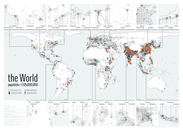
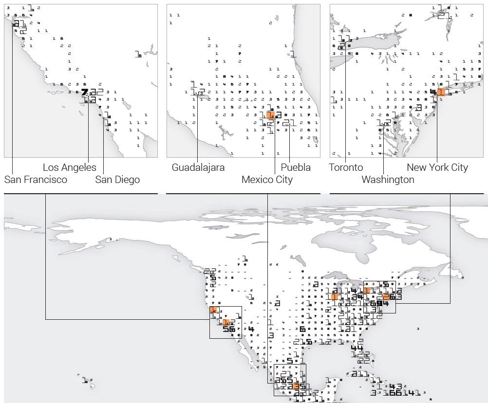
The map shows how the population of the world is distributed. It uses a typographic visualization technique–FatFonts–which allows you to read the exact number of people living in a particular area with a precision within 100,000 people. Each number in the world map corresponds to the population in an area of approx. 40,000 km².
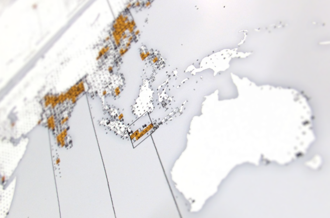
FatFonts – first conceived and designed by Miguel Nacenta and Uta Hinrichs – are digits that can be read as numbers, but also encode the information visually in the amount of ink that each digit uses. For example, digit eight 8 has eight times the amount of ink of digit one 1, digit seven 7 seven times and so on and so forth. This technique turns a table of numbers into a graphical representation where darker areas (with thicker numbers) represent higher population density. Stepping away from the map gives you an overview of which areas are heavily populated, coming closer lets you read the exact values.
To represent population densities from the tens of millions in a square (e.g., in New York City or Istanbul) to the hundreds of thousands, we use two layers: the FatFont numbers with orange backgrounds represent tens of millions of people. For example, the square that contains Buenos Aires shows you that fourteen million people live in that square of the world (the smaller 4 within the larger 1 represents the smaller order of magnitude). Tiles without an orange background represent populations between 9.9 million people to 100,000 (one order of magnitude lower).
This is an effective way to represent several orders of magnitude. The effect is quite mesmerising, and it gives you a good idea of where people actually live. Although it is possible to represent the same data with colours (i.e., colour scales), it is something different to see also the number itself. With the number you can easily make comparisons, calculate proportions, and relate what you see with the knowledge that you have already.
After a few minutes of looking at the map it starts to really sink in how empty some areas of the planet really are (Australia!), and how the real population centroid of the world is clearly in South East Asia. The map uses an equal-area projection; the numbers that you read are, therefore, also population densities. The representation is derived from the 2005 estimations for 2015 of the GPWFE dataset made available by SEDAC, Columbia University. 15 insets highlight interesting areas of high and low population in more detail, such as Northern China, Mexico City, Egypt, Western Japan, Bangladesh and Africa’s Great Lakes region.