

FatFonts
Miguel Nacenta, Uta Hinrichs, Sheelagh Carpendale, Robin Nabel, Constant Manteau and Johannes Lang
Abstract
FatFonts is a graphical technique conceived and developed by Miguel Nacenta, Uta Hinrichs, and Sheelagh Carpendale.
The FatFonts technique is based on a new type of numeric typeface designed for visualization purposes that bridge the gap between numeric and visual representations. FatFonts are based on Indo-arabic numerals but, unlike regular numeric typefaces, the amount of ink (dark pixels) used for each digit is proportional to its quantitative value. This enables accurate reading of the numerical data while preserving an overall visual context.
How it works
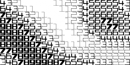
Fatfonts are designed so that the amount of dark pixels in a numeral character is proportional to the number it represents. For example, “2″ has twice the ink than “1″, “8″ has two times the amount of dark ink than “4″ etc. You can see this easily in the set of characters below:

This proportionality of ink is the main property of FatFonts. It allows us to create images of data where you can read the numbers, and represent tables that can be read as images (like the example below).
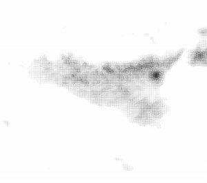
Sicily rendered in FatFonts
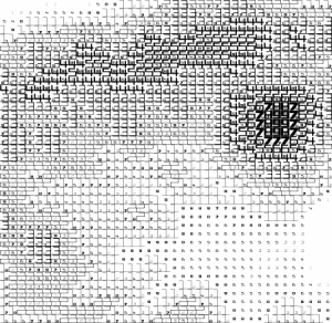
Close Up of Volcano
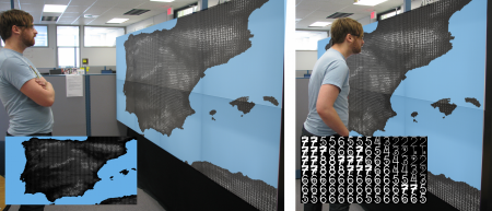
FatFonts on Wall Display
Video
Publications
Nacenta, M , Hinrichs, U & Carpendale, S 2012, ‘ FatFonts: Combining the Symbolic and Visual Aspects of Numbers ‘. in Proceedings of the International Working Conference on Advanced Visual Interfaces. ACM Press – Association for Computing Machinery, New York, pp. 407-414.